Home & Living
Paint By Numbers
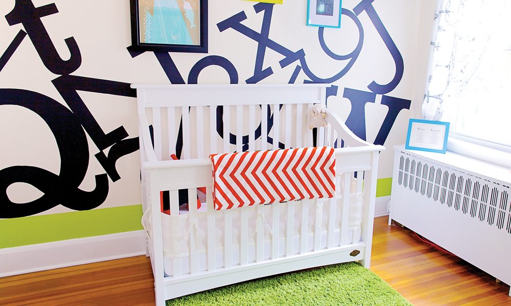
Graphic designer Jeremy Martin’s DIY nursery.
DESIGNER’S VISION: I started off with the idea that we wanted to do something stark and plain; to keep it black-and-white for the most part. Me being a graphic designer—I own my own small ad agency called Mammoth Creative Studio in Hampden—I thought type was the way to go. It was something that could be gender neutral since we didn’t have an idea of what Sawyer was going to be at that point. We had a rough color palette—using the green as an accent color.
LABOR OF LOVE: I built the flat panels to scale in Adobe Illustrator and took it into Cinema 4D to lay it out. [My wife] Emily and I sat up one night and projected it onto the walls and traced it. I spent about two weeks after that going over it with a 1/8-inch brush, hand-painting the edges and details, three coats total. It was a labor of love; there were about 70 to 80 hours put into it. It was my contribution, a way for me to really kind of feel connected to the baby.
PLAIN AND SIMPLE: All of the furnishings are super plain because everything else is not at all. The crib and the dresser are from Bye, Bye Baby, which is an amazing store. The monster pillow actually came from England—I found it on Fab.com. The knobs are from Anthropologie—they have such a great selection.
ABC: I wanted a good representation of modern, slab, and sans serif, mixed with some old-school. I didn’t want it to be every single letter in a million different fonts because I think that would have been too much. In itself it’s pretty simple—a good representation of the design world.
WORDS OF WISDOM: One suggestion I would give to people: Keep your background simple and let the other things on top do the talking.